
Ridgeline Plots: The Perfect Way to Visualize Data Distributions with Python
Represent your data as a mountain range — and uncover hidden patterns along the way.

Are you tired of drawing histograms or density plots for every variable and every subset?
There’s an easier solution. Ridgeline plots are a go-to visualization for visualizing data distributions as mountain ranges - both for single and multiple variables simultaneously. Today, you’ll learn how to visualize weather data distributions with ridgeline plots in Python.
If you’re a paid subscriber, feel free to download the data and the notebook.
Dataset Loading and Preprocessing
The dataset you’ll use today is called Rain in Australia, so please download it. You won’t use it to predict rain, as it says in the description, but to make visualizations.
You’ll use only four columns:
Date– useful for extracting monthly informationLocation– you’ll work only with Sydney dataMinTemp– minimum temperature for the dayMaxTemp– maximum temperature for the day
Before proceeding to dataset loading, there’s one library you need to install — joypy. It is used to make joyplots or ridgeline plots in Python:
pip install joypyHere’s how to load the dataset. Keep in mind that you only want the four mentioned columns:
import pandas as pd
import matplotlib.pyplot as plt
from joypy import joyplot
plt.style.use("custom_light.mplstyle")

df = pd.read_csv("../data/weatherAUS.csv", usecols=["Date", "Location", "MinTemp", "MaxTemp"])
print(f"Num. records: {len(df)}")
df.sample(5)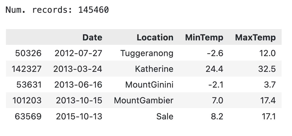
I’m using my custom light Matplotlib theme for the article:

Onto the preparation now. The to-do list is quite short:
Create a data frame
sydneywhich has data only for this townDitch the
LocationcolumnConvert
Datecolumn todatetime64typeExtract month names from the date
Here’s the code:
sydney = df.query("Location == 'Sydney'")
sydney = sydney.drop("Location", axis=1)
sydney["Date"] = sydney["Date"].astype("datetime64[ns]")
sydney["Month"] = sydney["Date"].dt.month_name()

print(f"Num. records: {len(sydney)}")
sydney.sample(5)
It’s starting to look good, but you’re not done yet. The dataset isn’t aware of the relationship between the months. As a result, ordering them on a chart is a nightmare.
Pandas has a CategoricalDtype class that can help you with this. You have to specify the ordering of the categories and make the conversion afterward. Here’s how:
from pandas.api.types import CategoricalDtype

cat_month = CategoricalDtype(
    ["January", "February", "March", "April", "May", "June",
     "July", "August", "September", "October", "November", "December"]
)

sydney["Month"] = sydney["Month"].astype(cat_month)
sydney.dtypes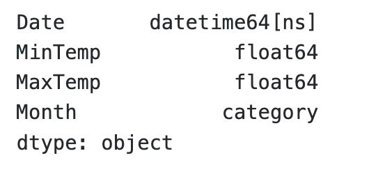
You’re done, preparation-wise! Time to make some ridgeline plots.
Ridgeline Plot for a Single Variable
Drawing a chart boils down to a single function call. Here’s the code you’ll need to make a ridgeline plot of maximum temperatures in Sydney:
joyplot(
    data=sydney[["MaxTemp", "Month"]],
    by="Month",
    figsize=(12, 8),
    color="#9B1D20"
)
plt.title("Ridgeline Plot of Max Temperatures in Sydney")
plt.show()
You could ditch the first and last two lines if you don’t care about the title. A call to joyplot() is enough.
Here’s what the visualization looks like:
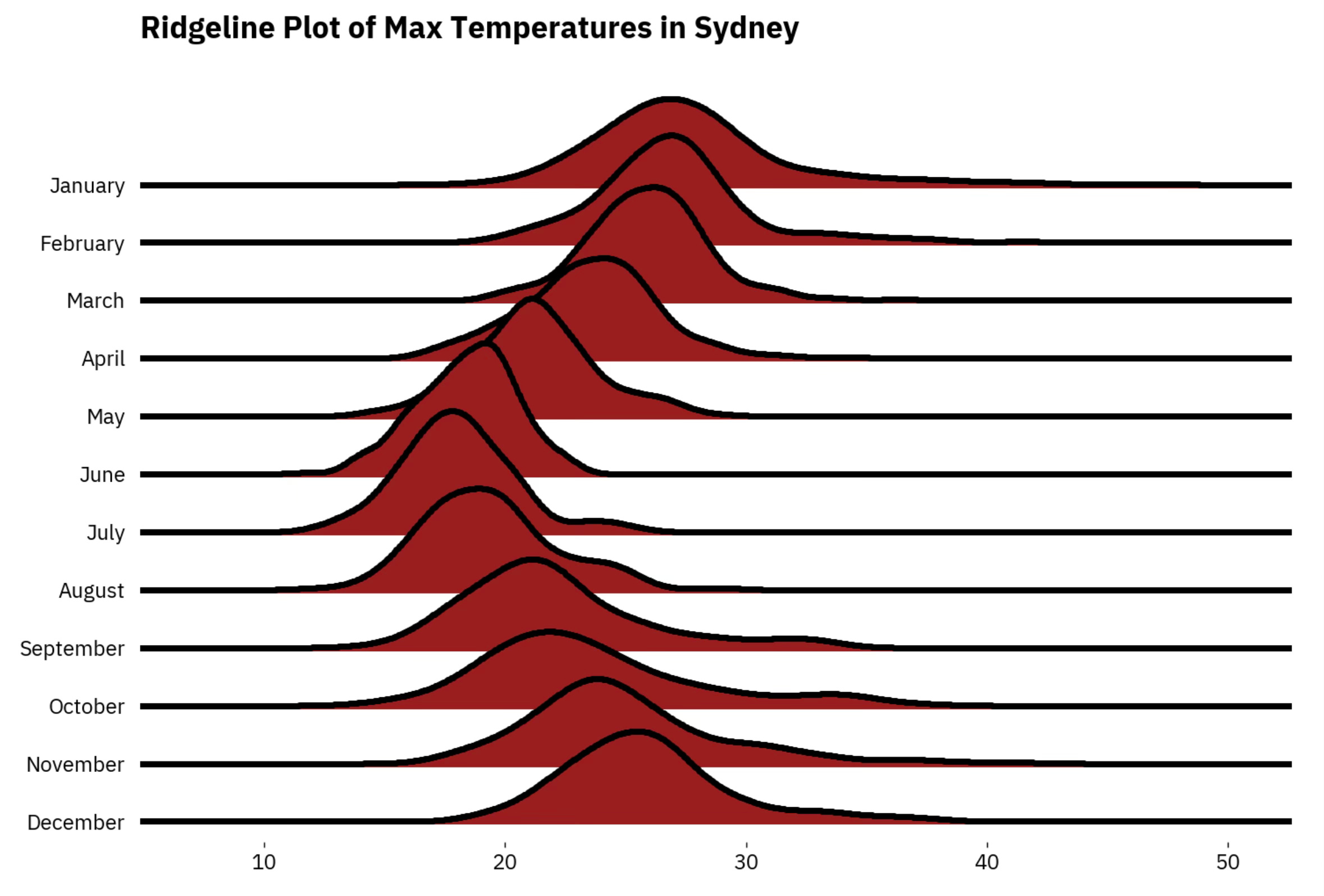
It took me a moment to realize nothing was wrong with the visualization. The dataset contains temperature data for Australia. The seasons there are opposite from the ones in the northern hemisphere.
Let’s see how to make things more complex by introducing a second variable to the plot.
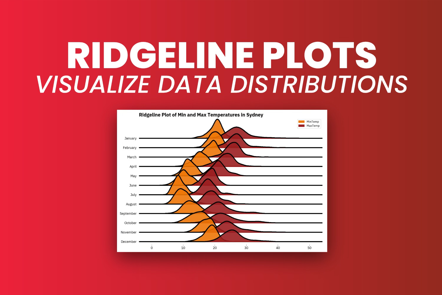
Ridgeline Plot for Multiple Variables
In addition to plotting distributions for max temperatures, you’ll now include the min temperature. Once again, thejoyplot library makes it easy:
ax, fig = joyplot(
    data=sydney[["MinTemp", "MaxTemp", "Month"]],
    by="Month",
    column=["MinTemp", "MaxTemp"],
    color=["#F07605", "#9B1D20"],
    legend=True,
    alpha=0.9,
    figsize=(12, 8)
)
plt.title("Ridgeline Plot of Min and Max Temperatures in Sydney")
plt.show()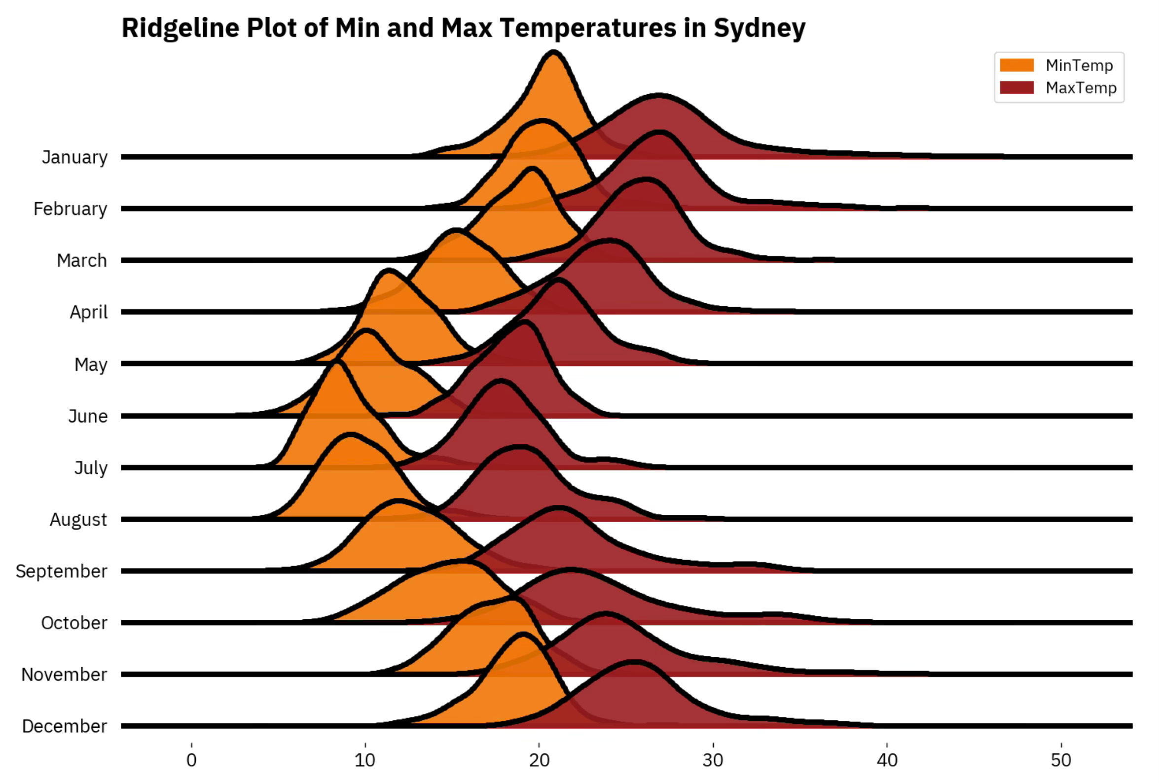
Take a moment to appreciate how much information is shown on this single chart. It would take you 24 density plots for the most naive approach, and comparisons wouldn’t be nearly as easy.
Let’s wrap things up next.
Wrapping up
And that’s ridgeline plots in a nutshell. You could do more - like coloring the area under the curve by some variable. The official documentation is packed with examples, so explore it if you have the time.
To summarize - use ridgeline plots whenever you need to visualize distributions of variables and their segments in a compact way.
Drawing histograms and density plots manually for variable segments is something you should avoid.