


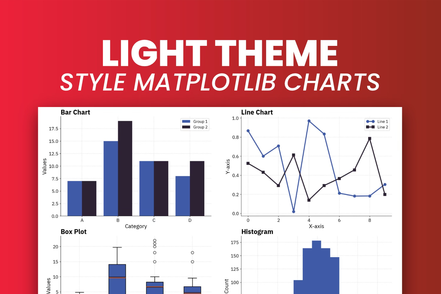
Here's My Custom Light Theme That Will Make Your Matplotlib Charts Look Amazing
The exact mplstyle file I use for every light-themed Matplotlib chart

An average person is bombarded with up to 10000 ads per day.
As a data visualization professional, your job is to capture attention. It doesn’t matter how valuable your data is if the presentation is an eyesore. You need something custom, something unique to your style and voice.
This article brings you the theme I use for all light-themed visualizations with Matplotlib. You can use it wherever you want, even commercially. The only thing you might want to change is font and colors, especially for corporate environments.
You’ll need the following Python libraries to follow along:
import numpy as np
import matplotlib as mpl
import matplotlib.pyplot as plt
Once installed, continue reading to find out the exact tweaks I made to make my charts stand out.
What’s Wrong With Matplotlib’s Default Theme?
A couple of things are plain wrong, others are a personal preference.
In short, there’s no reason to ever make a low-resolution chart. There’s no reason to use a color palette seen millions of times. It works, but it won’t make the end user stop scrolling. And finally, there’s no reason to stick with default font and sizing choices.
The last one is a personal preference, but you’ll see how much impact it has on the result.
For now, copy the following code - it plots a 2x2 grid showing a bar chart, line chart, boxplot, and histogram:
def plot_charts():
    # Generate sample data
    np.random.seed(42)
    categories = ["A", "B", "C", "D"]
    values1 = np.random.randint(1, 20, size=4)
    values2 = np.random.randint(1, 20, size=4)
    x = np.arange(len(categories))
    y_line1 = np.random.rand(10)
    y_line2 = np.random.rand(10)
    x_line = np.arange(10)
    histogram_data = np.random.randn(1000)
    box_data = [(np.random.rand(50) * 10) - 5,
        np.random.rand(50) * 20,
        np.append(np.random.rand(50) * 10, [15, 22, 20, 18, 21]),
        np.append(np.random.rand(50) * 10, [-5, -7, -8, 15, 18])
    ]

    _, axs = plt.subplots(2, 2, figsize=(18, 12))

    # Bar chart
    axs[0, 0].bar(x - 0.2, values1, 0.4, label="Group 1")
    axs[0, 0].bar(x + 0.2, values2, 0.4, label="Group 2")
    axs[0, 0].set_title("Bar Chart")
    axs[0, 0].set_xticks(x)
    axs[0, 0].set_xticklabels(categories)
    axs[0, 0].set_xlabel("Category")
    axs[0, 0].set_ylabel("Values")
    axs[0, 0].legend()

    # Line chart
    axs[0, 1].plot(x_line, y_line1, marker="o", label="Line 1")
    axs[0, 1].plot(x_line, y_line2, marker="s", label="Line 2")
    axs[0, 1].set_title("Line Chart")
    axs[0, 1].set_xlabel("X-axis")
    axs[0, 1].set_ylabel("Y-axis")
    axs[0, 1].legend()

    # Boxplot
    axs[1, 0].boxplot(box_data, patch_artist=True)
    axs[1, 0].set_title("Box Plot")
    axs[1, 0].set_xlabel("Category")
    axs[1, 0].set_ylabel("Values")
    axs[1, 0].set_xticklabels(categories)

    # Histogram
    axs[1, 1].hist(histogram_data)
    axs[1, 1].set_title("Histogram")
    axs[1, 1].set_xlabel("Value")
    axs[1, 1].set_ylabel("Count")
The function takes care of data generation and plotting, so the only thing you need to do is to call it:
plot_charts()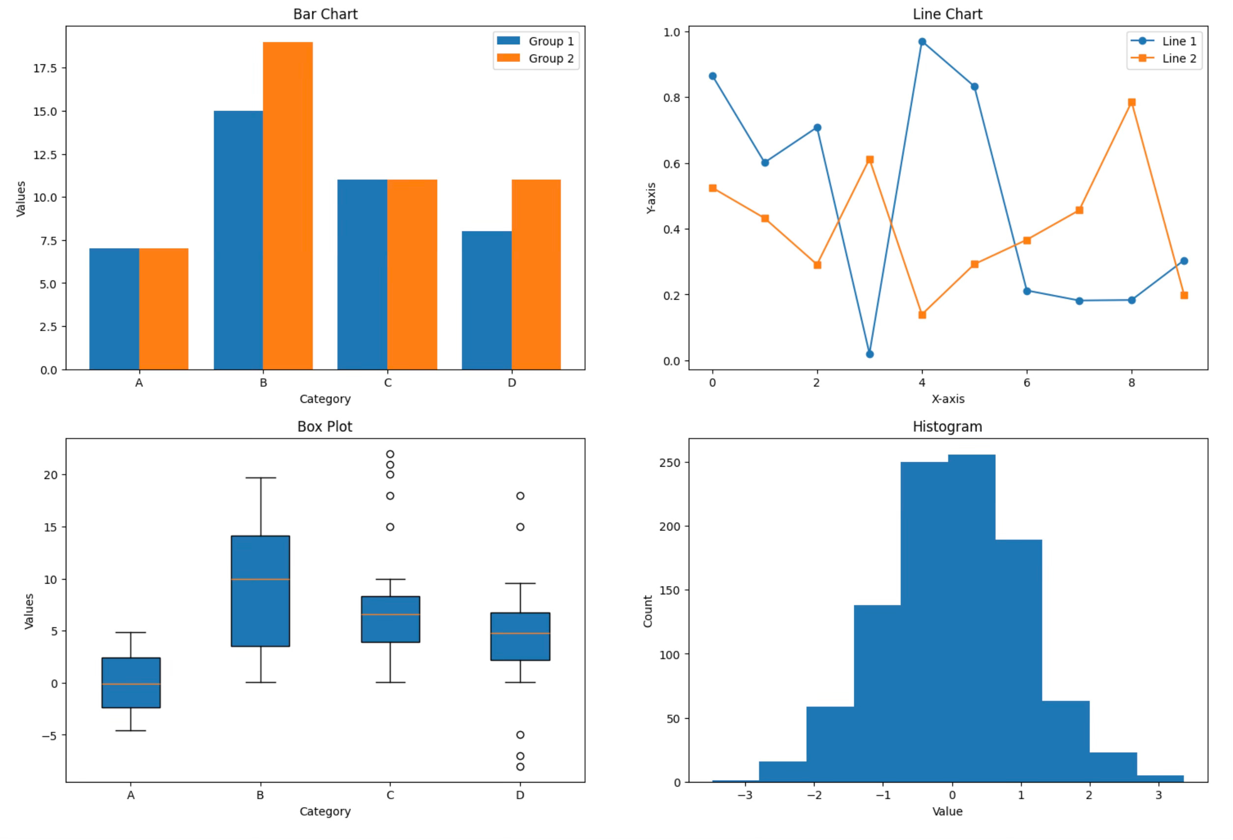
Long story short, it’s boring and won’t capture anyone’s attention.
Here’s My Custom Light Theme for Matplotlib
I’ve already covered the process of creating a custom Matplotlib theme - from writing a mplstyle file to making it available globally. Read that article first if you’re new.
This is the exact theme I use for each and every light-themed chart in Matplotlib:
Keep reading with a 7-day free trial
Subscribe to Data Doodles with Python to keep reading this post and get 7 days of free access to the full post archives.