How to Create Custom Color Palettes in Matplotlib - Discrete vs. Linear Colormaps Explained
Actionable guide on how to bring custom colors to personalize your charts.
If there’s one thing that’ll make a good chart great, it’s the color choice.
You can turn any set of hex color codes into a color palette with Matplotlib, and this article will show you how. You’ll also learn the difference between discrete and linear color palettes, and the reasons why one is better than the other.
If you want to get the same data visualization quality I have, follow the steps from this article before proceeding:
How to Create Custom Colormaps in Matplotlib
These are the libraries you’ll need to follow along:
import numpy as np
import pandas as pd
import matplotlib as mpl
import matplotlib.pyplot as plt
Matplotlib allows you to create two types of color palettes:
Discrete - The palette has a finite number of color values. Great for categorical data, but you need to make sure the palette has at least as many colors as you have distinct categories.
Linear (continuous) - The palette has an “infinite” number of values. Great for continuous and categorical data. You can specify just two colors, and the palette will automatically include all the values between them (think: gradient in Photoshop).
To create a discrete color palette in Matplotlib, run the following:
cmap_discrete = mpl.colors.ListedColormap(
    name="discrete-monochromatic-blue",
    colors=["#051923", "#003554", "#006494", "#0582ca", "#00a6fb"]
)
cmap_discreteAnd to create a linear (continuous) color palette, run this code snippet:
cmap_linear = mpl.colors.LinearSegmentedColormap.from_list(
    name="linear-monochromatic-blue",
    colors=["#051923", "#003554", "#006494", "#0582ca", "#00a6fb"]
)
cmap_linearYou can see how the discrete palette has 5 distinct colors, while the linear palette takes a continuous range of values.
What’s the difference when visualizing data? That’s what you’ll learn next.
Comparison - Discrete vs. Linear Colormap on Continuous Data
In this section, you’ll create a 10x10 matrix of random numbers [0.0, 1.0) and visualize it as an image.
Run the following snippet to create the data:
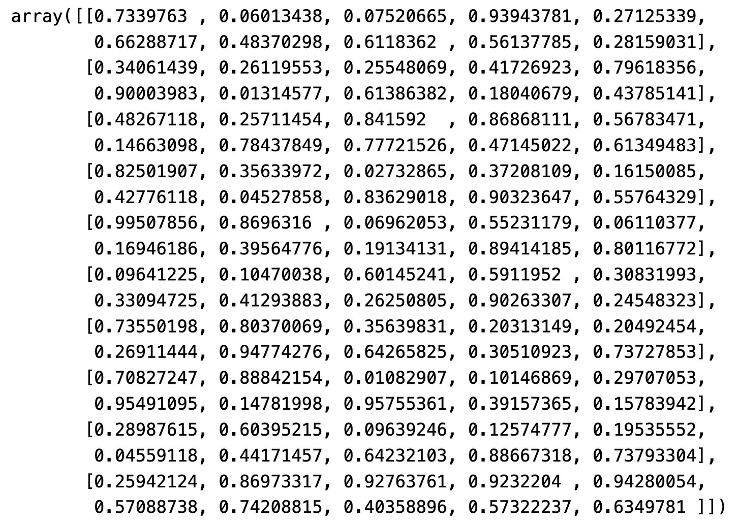
data = np.random.random(100).reshape(10, 10)
dataAs for the visual, you’ll want to create a 1x2 grid and show the identical dataset colored through a discrete colormap on the left, and a linear colormap on the right:
fig, (ax1, ax2) = plt.subplots(1, 2, figsize=(10, 5))

cax1 = ax1.imshow(data, cmap=cmap_discrete)
ax1.set_title("Discrete Colormap", loc="left", fontdict={"weight": "bold"}, y=1.04)
fig.colorbar(cax1, ax=ax1)

cax2 = ax2.imshow(data, cmap=cmap_linear)
ax2.set_title("Linear Colormap", loc="left", fontdict={"weight": "bold"}, y=1.04)
fig.colorbar(cax2, ax=ax2)

plt.tight_layout()
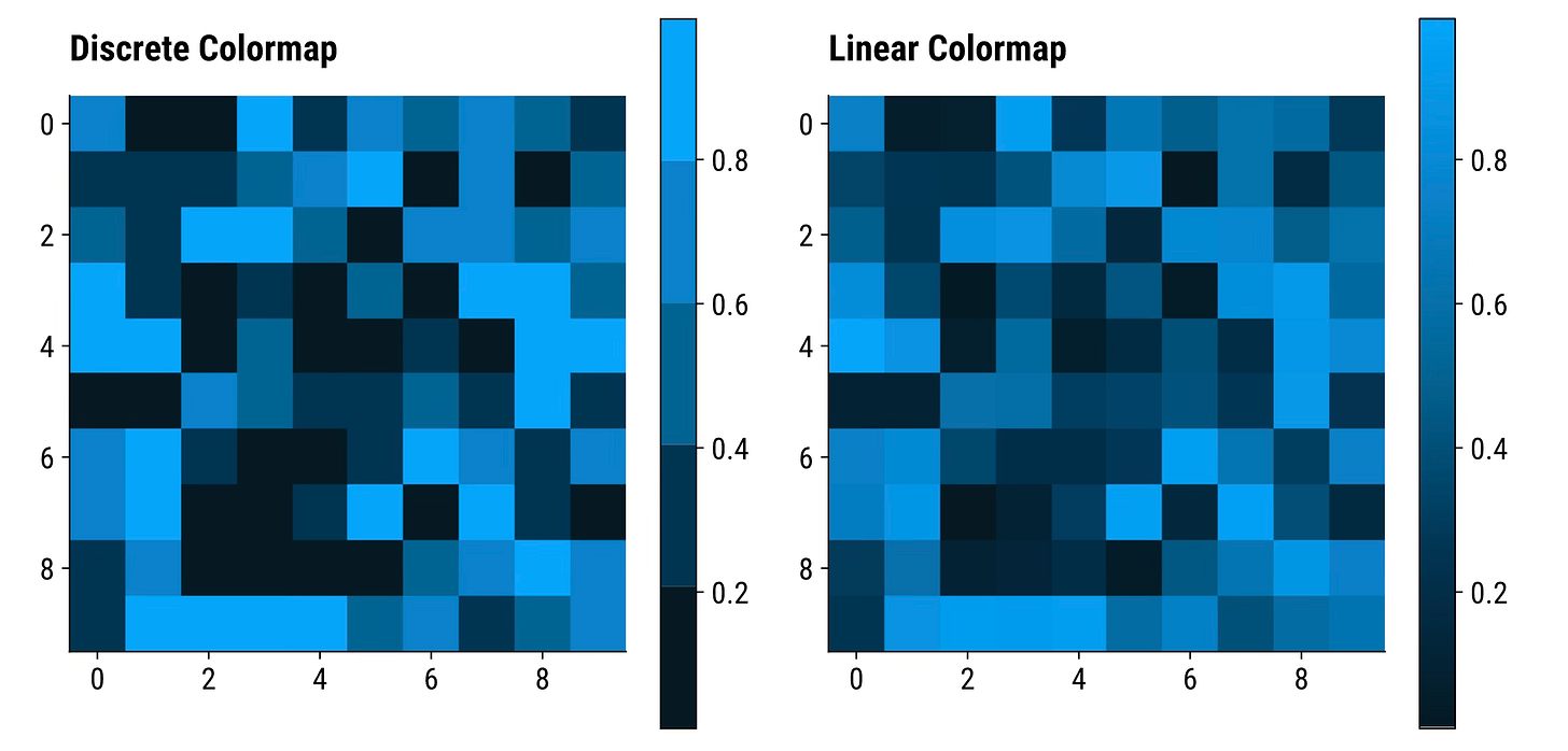
plt.show()The underlying data is the same, but the plot on the left can take up to 5 possible color values. The one on the right has a much wider range.
To conclude - linear color palettes can be used to visualize both continuous and categorical data, while discrete color palettes can only do the latter without information loss.
Real-World Plots - How to Add Custom Colors to Your Charts
You’ll now see how to apply a custom color palette to bar charts in Matplotlib.
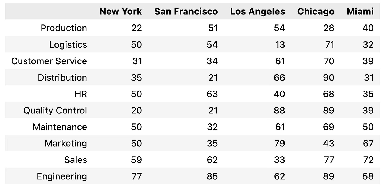
To start, copy the following code snippet to create mock employee count data across 10 departments and 5 office locations:
df = pd.DataFrame({
    "HR": [50, 63, 40, 68, 35],
    "Engineering": [77, 85, 62, 89, 58],
    "Marketing": [50, 35, 79, 43, 67],
    "Sales": [59, 62, 33, 77, 72],
    "Customer Service": [31, 34, 61, 70, 39],
    "Distribution": [35, 21, 66, 90, 31],
    "Logistics": [50, 54, 13, 71, 32],
    "Production": [22, 51, 54, 28, 40],
    "Maintenance": [50, 32, 61, 69, 50],
    "Quality Control": [20, 21, 88, 89, 39]
}, index=["New York", "San Francisco", "Los Angeles", "Chicago", "Miami"])

df = df.T
df = df.loc[df.sum(axis=1).sort_values().index]

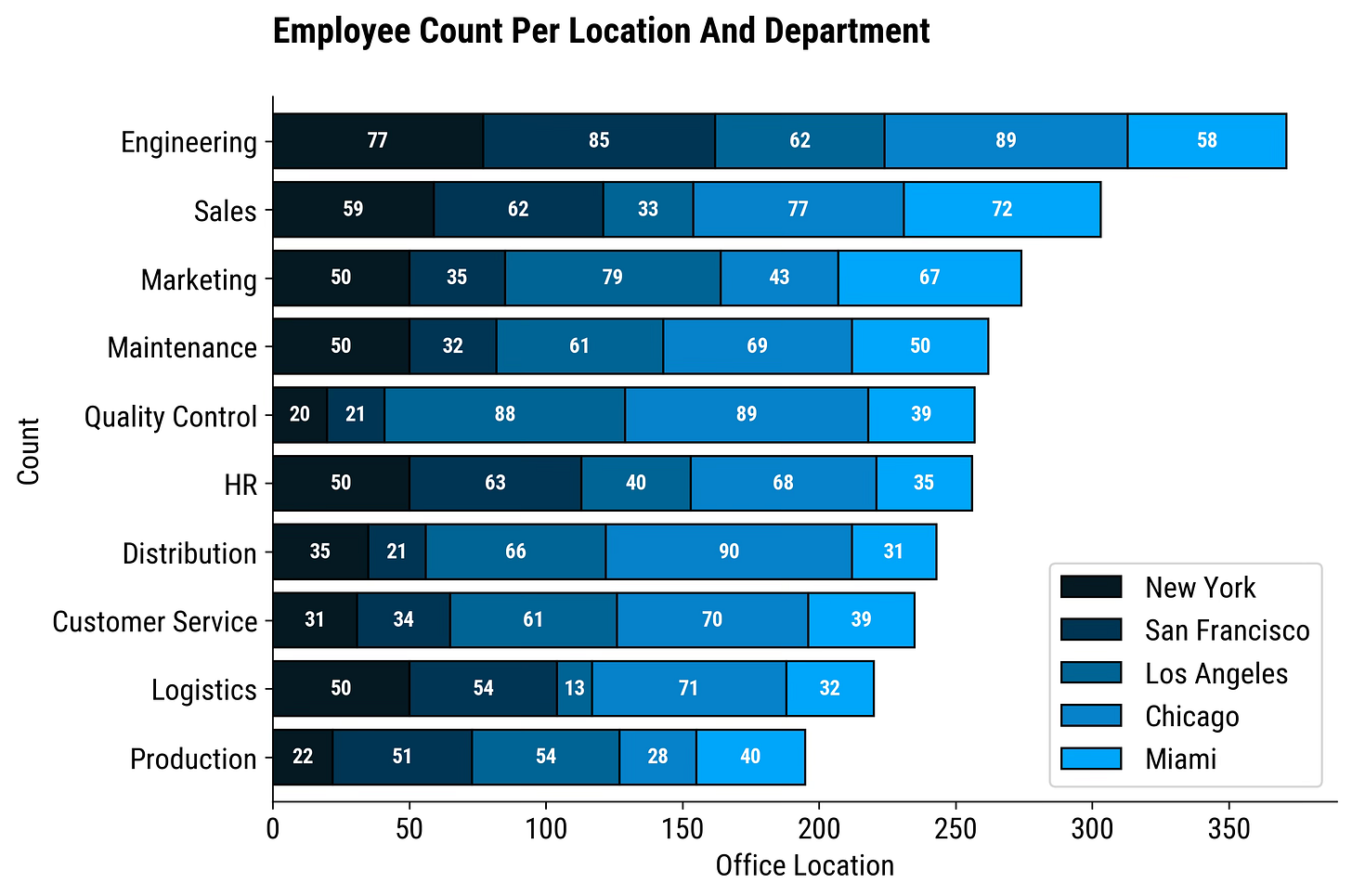
dfSince there are 5 office locations, and our discrete color palette has 5 colors, it’s a perfect match for visualization.
The only new parameter you need to know in plot() is colormap. You’ll have to provide your palette variable. I’ve added employee counts to each bar segment, but consider this part optional:
ax = df.plot(kind="barh", colormap=cmap_discrete, width=0.8, edgecolor="#000000", stacked=True)

for container in ax.containers:
    ax.bar_label(container, label_type="center", fontsize=10, color="#FFFFFF", fontweight="bold")

plt.title("Employee Count Per Location And Department", loc="left", fontdict={"weight": "bold"}, y=1.06)
plt.xlabel("Office Location")
plt.ylabel("Count")

plt.show()Looks great, doesn’t it?
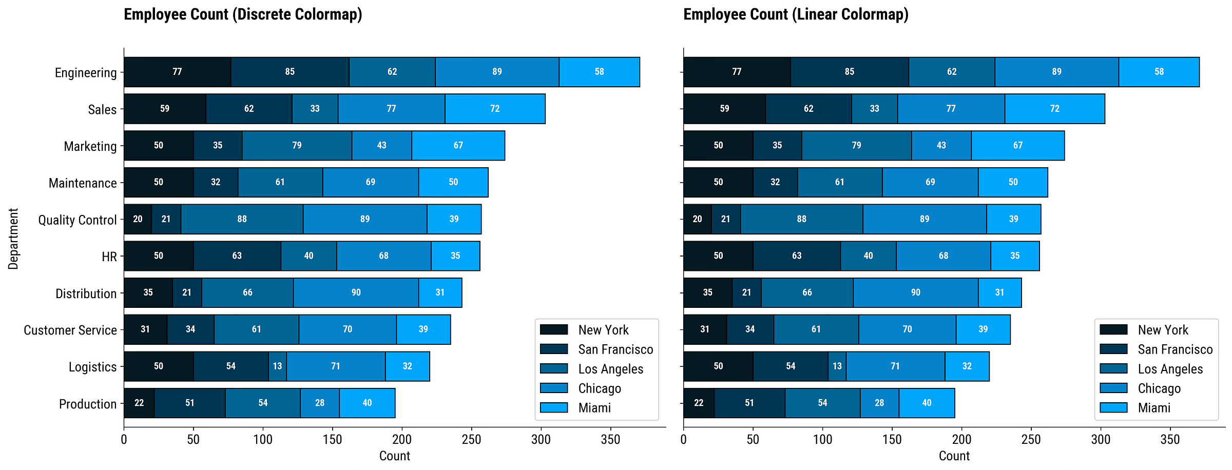
You shouldn’t see any difference when comparing discrete and linear color palettes for this visualization. Why? Because the discrete palette has 5 colors, and you have 5 groups in the data.
Still, let’s define a function that will compare the two palette categories:
def plot_employee_count_comparison(df, cmap1, cmap2):
    _, (ax1, ax2) = plt.subplots(1, 2, figsize=(18, 7), sharex=True, sharey=True)

    df.plot(kind="barh", colormap=cmap1, width=0.8, edgecolor="#000000", stacked=True, ax=ax1)
    for container in ax1.containers:
        ax1.bar_label(container, label_type="center", fontsize=10, color="#FFFFFF", fontweight="bold")
    ax1.set_title("Employee Count (Discrete Colormap)", loc="left", fontdict={"weight": "bold"}, y=1.06)
    ax1.set_xlabel("Count")
    ax1.set_ylabel("Department")

    df.plot(kind="barh", colormap=cmap2, width=0.8, edgecolor="#000000", stacked=True, ax=ax2)
    for container in ax2.containers:
        ax2.bar_label(container, label_type="center", fontsize=10, color="#FFFFFF", fontweight="bold")
    ax2.set_title("Employee Count (Linear Colormap)", loc="left", fontdict={"weight": "bold"}, y=1.06)
    ax2.set_xlabel("Count")
    ax2.set_ylabel("Department")

    # Adjust layout
    plt.tight_layout()
    plt.show()


plot_employee_count_comparison(df=df, cmap1=cmap_discrete, cmap2=cmap_linear)Both plots are identical. But that won’t always be the case.
What Happens When You Have More Categories Then Colors in A Discrete Color Palette?
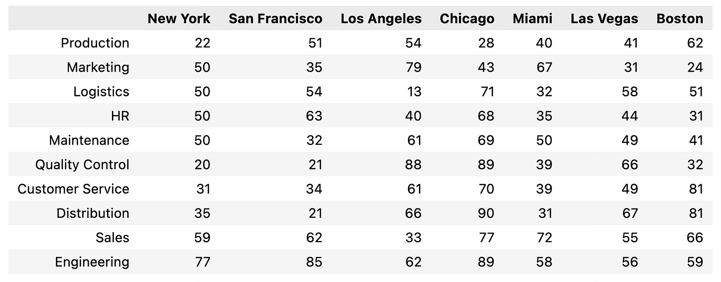
Good question. Let’s answer it by expanding the Pandas DataFrame to include two additional office locations:
df = pd.DataFrame({
    "HR": [50, 63, 40, 68, 35, 44, 31],
    "Engineering": [77, 85, 62, 89, 58, 56, 59],
    "Marketing": [50, 35, 79, 43, 67, 31, 24],
    "Sales": [59, 62, 33, 77, 72, 55, 66],
    "Customer Service": [31, 34, 61, 70, 39, 49, 81],
    "Distribution": [35, 21, 66, 90, 31, 67, 81],
    "Logistics": [50, 54, 13, 71, 32, 58, 51],
    "Production": [22, 51, 54, 28, 40, 41, 62],
    "Maintenance": [50, 32, 61, 69, 50, 49, 41],
    "Quality Control": [20, 21, 88, 89, 39, 66, 32]
}, index=["New York", "San Francisco", "Los Angeles", "Chicago", "Miami", "Las Vegas", "Boston"])

df = df.T
df = df.loc[df.sum(axis=1).sort_values().index]

dfIn theory, a discrete color palette should fail since it only has 5 color values and the dataset has 7 categories.
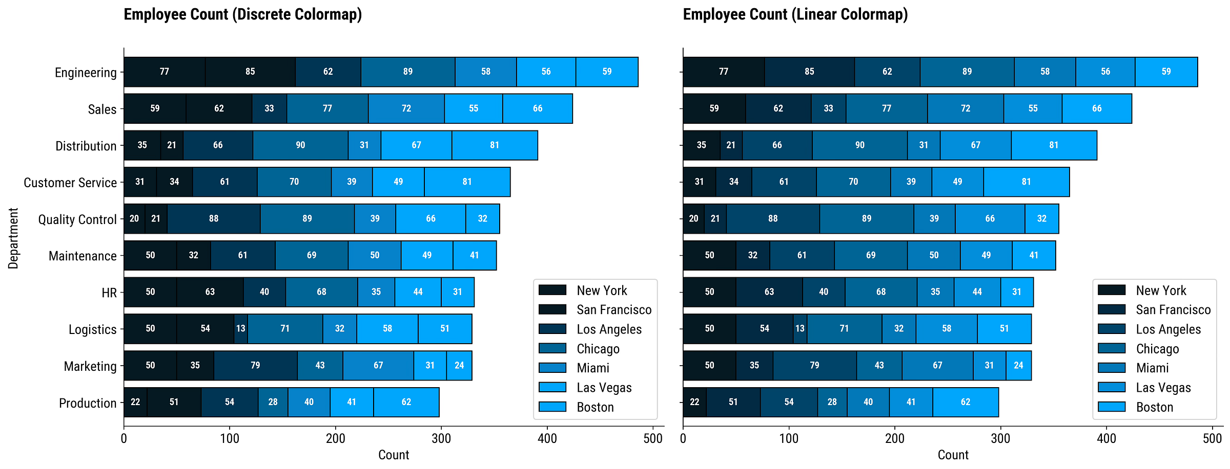
Let’s use the plot_employee_count_comparison() function to see the differences:
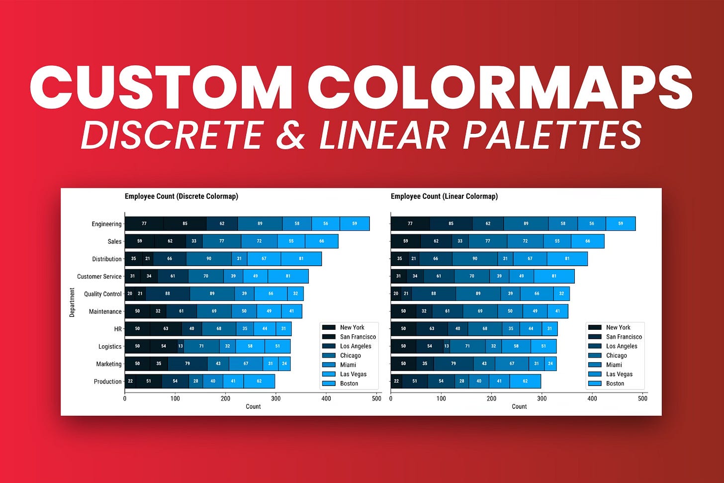
plot_employee_count_comparison(df=df, cmap1=cmap_discrete, cmap2=cmap_linear)The left chart is unusable.
Just look at the first column for employee count combinations (77, 85) and (56, 59). They use the same color! Matplotlib uses the colors provided in the center of the chart, and the edges take values from the neighboring points.
In short, not what you want.
You don’t get this type of issue with linear color palettes, even if you construct it from two colors only.
Wrapping up
To summarize, a custom color palette might be just what your chart needs to make it publication-worthy.
Also, if you’re working at a company, chances are they already have a set of colors defined. Using them from the get-go is a guaranteed way to remove at least one submission iteration.
Matplotlib makes creating custom discrete and linear color palettes a breeze. Both can be used on categorical data, but only the latter works properly on continuous data. In this use case, a discrete color palette is obsolete, as you can get the same result (and more) with a linear palette.
What are your favorite color combinations for data visualization? Please share in the comment section below.
Download today’s notebook:


