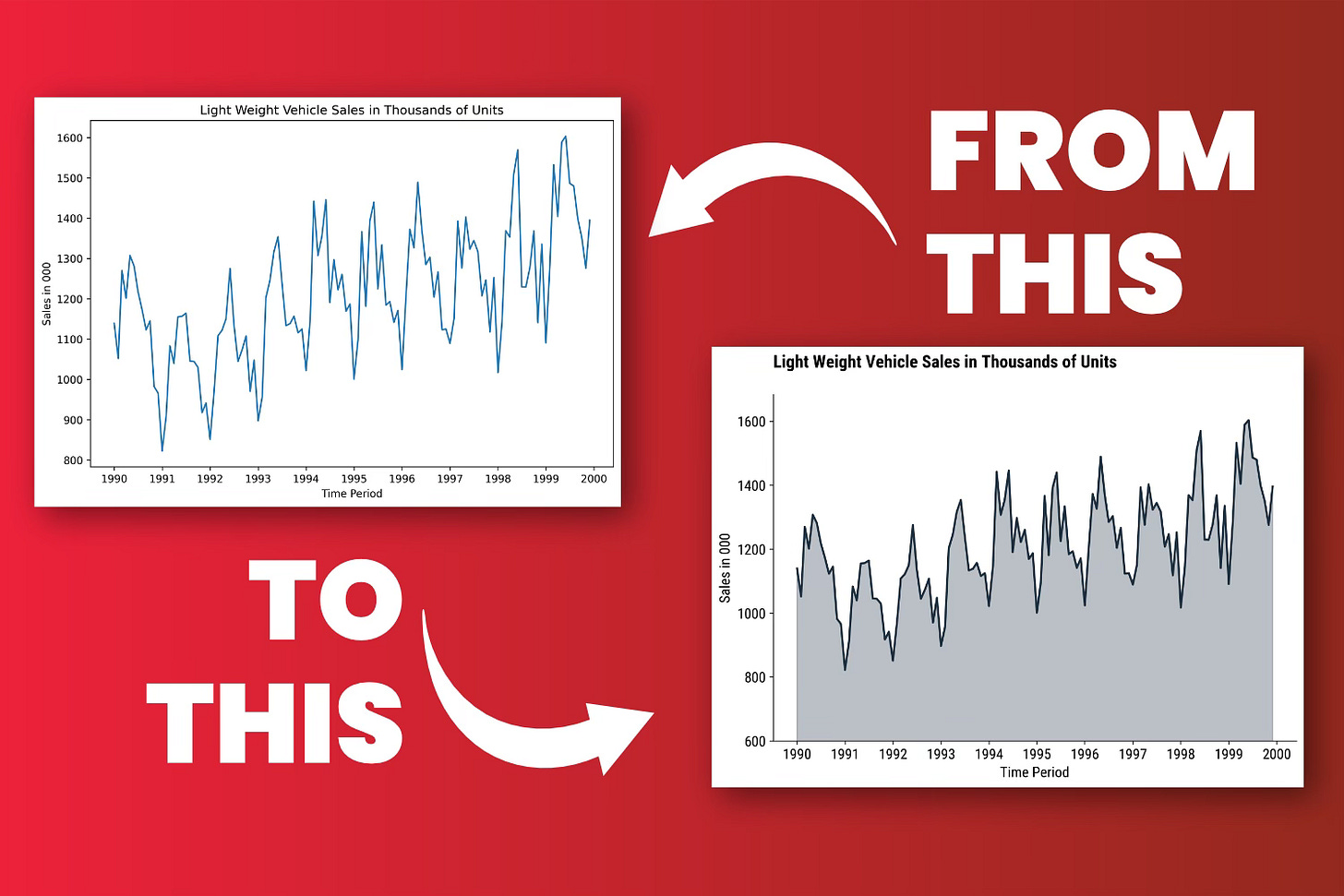
3 Key Things You Must Change Right Now To Make Your Charts Stand Out
Matplotlib charts look horrendous by default - here's what to do about it.
Data visualization offers much deeper insights than looking at raw, numerical data.
However, creating appealing charts takes time and effort. Matplotlib is a de facto standard library for data visualization in Python. It’s simple, has been used for decades, and anything you're looking for is one web search away.
But it’s not all sunshine and rainbows. Matplotlib visualizations look horrendous by default, and you as a data professional will have to turn many cogs to get something usable. Getting you there is the goal of today’s article.
By the end, you’ll have a code snippet you can stick to any Jupyter Notebook.
What’s Wrong with Matplotlib’s Default Styles?
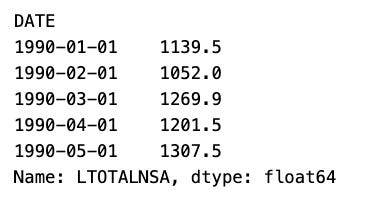
I’m using the Light Weight Vehicle Sales dataset from FRED, and loading it to Python with the following command:
import pandas as pd
import matplotlib.pyplot as plt

data = pd.read_csv("../data/LTOTALNSA.csv", index_col="DATE", parse_dates=True)
data = data["LTOTALNSA"]["1990-01-01":"1999-12-01"]
data.head()Since the dataset has dates for an index, and float values for the only attribute, you can plot the entire thing directly via plt.plot():
plt.figure(figsize=(9, 6))
plt.plot(data)
plt.show()Everything about it screams 2002. Low resolution. The surrounding box. The font size.
Nothing a couple of tweaks can’t fix.
Tweak #1 - Adjust rcParams to Set the Overall Theme
Tweaking every chart by hand is a sure way to waste your time.
After all, most charts you make will have an underlying theme. It makes sense to declare it once and reuse it everywhere. That’s the role of rcParams.
The following code snippet changes a whole bunch of them and ensure your charts are rendered as SVGs. This last bit won’t matter if you explicitly save your charts to disk, but it will make a huge difference in a notebook environment:
import matplotlib_inline
matplotlib_inline.backend_inline.set_matplotlib_formats("svg")

plt.rcParams.update({
    "figure.figsize": (9, 6),
    "axes.spines.top": False,
    "axes.spines.right": False,
    "font.size": 14,
    "figure.titlesize": "xx-large",
    "xtick.labelsize": "medium",
    "ytick.labelsize": "medium",
    "axes.axisbelow": True
})
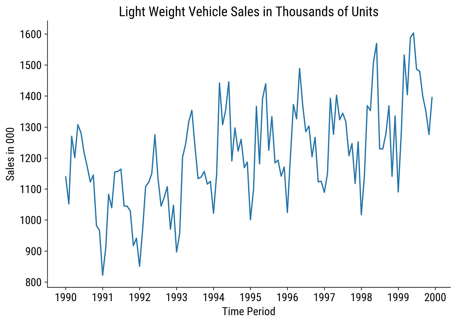
And now, when you repeat the call to plt.plot(), the chart will look somewhat presentable:
plt.plot(data)
plt.title("Light Weight Vehicle Sales in Thousands of Units")
plt.xlabel("Time Period")
plt.ylabel("Sales in 000")
plt.show()Not quite there yet, but the idea was just to set an underlying theme. You shouldn’t include chart-specific instructions in rcParams.
Tweak #2 - Bring the Font to the 21st Century
Another thing you can change in rcParams is the font.
You can download any TTF font from the internet, and load it via Matplotlib’s font_manager. I’ll use Roboto Condensed, but feel free to go with anything you like:
import matplotlib.font_manager as font_manager

font_dir = ["/Users/dradecic/Downloads/Roboto_Condensed"]
for font in font_manager.findSystemFonts(font_dir):
    font_manager.fontManager.addfont(font)

plt.rcParams.update({"font.family": "Roboto Condensed"})
To verify the font has changed, simply rerun the plotting snippet from earlier:
plt.plot(data)
plt.title("Light Weight Vehicle Sales in Thousands of Units")
plt.xlabel("Time Period")
plt.ylabel("Sales in 000")
plt.show()And that’s about all we’ll discuss regarding overall theme changes. Up next, let’s get specific.
Tweak #3 - Make Micro Adjustment Specific to Your Chart Type
Different chart types will have different go-to approaches when it comes to fine-tuning.
For line charts, you can change the line color and width, and potentially even add a filled area section to make the chart look more dashboardy.
The other changes made in the below snippet are purely cosmetic - title location and y-axis limit:
# 1. Line color and width
plt.plot(data, color="#1C3041", linewidth=2)
# 2. Add shaded area below the line
plt.fill_between(data.index, data.values, color="#1C3041", alpha=0.3)
# 3. Change title location and font weight
plt.title("Light Weight Vehicle Sales in Thousands of Units", loc="left", fontdict={"weight": "bold"}, y=1.06)

plt.xlabel("Time Period")
plt.ylabel("Sales in 000")
# 4. Set a custom axis limit
plt.ylim(bottom=600)
plt.show()Now this is almost a publication-ready visualization!
A couple of specific made all the difference, but that wouldn’t be possible without setting a strong foundation.
Wrapping Up
Many data professionals disregard Matplotlib entirely because of how it looks by default.
They think “It’s blurry and awful, I can’t send a visual like this to my boss.” The reality couldn’t be further away from the truth. You can change a bunch of parameters and end up with a code block you can bring anywhere - to every script, notebook, and environment.
I encourage you to play around with the parameters to further personalize the overall look and feel, and share your preferences in the comment section below.
Download today’s notebook:


