
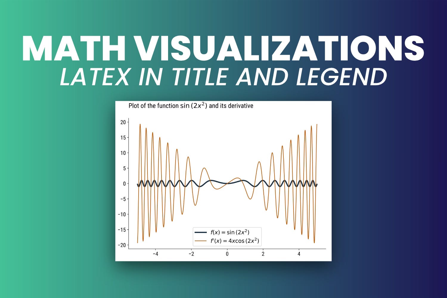
How to Add LaTeX Equations to Chart Title and Legend - Math Visualizations with Matplotlib #1
Turn mathematical expressions into LaTeX and add them to your Matplotlib Charts.

There’s nothing worse than reading an unstyled math equation.
Things take a turn for the worse when you want to show the equation in a chart title. Superscripts, subscripts, brackets, everything blends into an unstyled string of mathematical mess.
But there is a silver lining. You can convert math equations into LaTeX and display them standalone or combined with regular text. This way, your charts will become readable again.
After reading today’s article, you’ll know how to:
Validate math equations using SymPy
Turn SymPy expressions into LaTeX
Display LaTeX in Matplotlib chart title and legend
Let’s dig in!
How to Solve and Render Equations with Python
First, let’s make a brief primer on solving equations in Python.
You can do everything by hand, of course, but why? Python has a superb set of tools for symbolic math and equation solving. The only new library you’ll need today is SymPy, so install it before proceeding:
import numpy as np
import sympy as sym
import matplotlib as mpl
from IPython.display import display, Math
And now onto SymPy. Here’s what you need to know:
Symbolic Variables - You can define variables (like x, y, z) using
sym.symbols()and store them as Python variables. Once declared, they can be referenced in equations.SymPy Functions - After symbolic variables are defined, you can write equations by calling different SymPy functions, such as
sin(),exp(), ordiff().LaTeX Conversion - The
sym.latex()function is used to convert mathematical expressions to LaTeX.
The example below defines a symbolic variable x, implements a function f(x) and calculates its derivative:
# Define symbolic variable(s)
x = sym.symbols("x")

# Implement equations with SymPy
fx = sym.sin(2*x**2)
# sym.diff() differentiates the above equation
fx_diff = sym.diff(fx)

# Display in notebook
display(Math(f"f(x) = {sym.latex(fx)}"))
display(Math(f"f'(x) = {sym.latex(fx_diff)}"))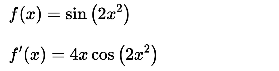
SymPy has a massive set of functions, and we’ve barely scratched the surface.
You won’t need anything else today, so let’s move along.
How to Add LaTeX to Matplotlib Charts
In this section, you’ll learn how to render equations in Matplotlib charts.
Before proceeding, I recommend skimming over my guide to tweaking Matplotlib’s default styles:
Add Equations to Plot Title
If you’re rendering a math formula as a chart, a logical place to add the equation is the plot title.
The problem arises when you want to combine regular text and math expressions. The solution is to surround the LaTeX code with dollar signs ($), just like you typically would when writing LaTeX. Python’s f-strings help you combine plain text with LaTeX:
Here’s what it looks like in code:
# Define symbols and equations
x = sym.symbols("x")
fx = sym.sin(2*x**2)
fx_diff = sym.diff(fx)

# Evaluate at different data points
xs = np.linspace(-5, 5, 1000)
ys_fx = sym.lambdify(x, fx)(xs)
ys_fx_diff = sym.lambdify(x, fx_diff)(xs)

# Plot
plt.plot(xs, ys_fx, color="#1C3041", linewidth=3)
plt.plot(xs, ys_fx_diff, color="#BA5E09")
plt.title(f"Plot of the function ${sym.latex(fx)}$ and its derivative", loc="left", y=1.06)
plt.show()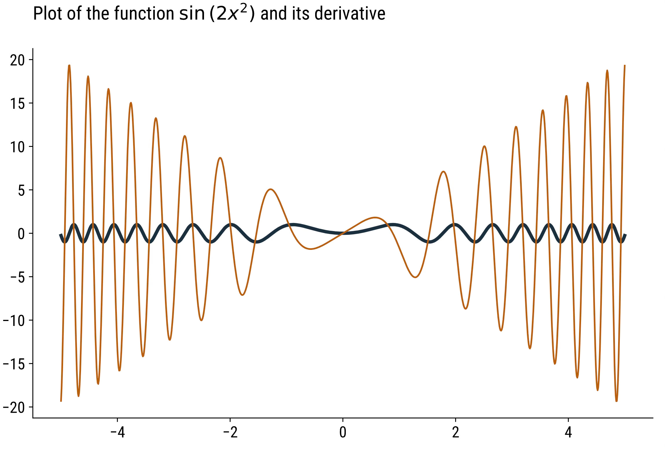
There's not much to it!
Add Equations to Plot Legend
An easy way to improve the above chart is to add equations to the legend.
The chart has two lines, so you’ll need a legend with two items. The label parameter in plt.plot() allows you to write a string that will be displayed in the legend field. Just like with the title, surround the LaTeX code with dollar signs ($).
Don’t forget to add a call to plt.legend() or the legend won’t be displayed:
# Simply add labels and a call to legend()
plt.plot(xs, ys_fx, color="#1C3041", linewidth=3, label=f"$f(x) = {sym.latex(fx)}$")
plt.plot(xs, ys_fx_diff, color="#BA5E09", label=f"$f'(x) = {sym.latex(fx_diff)}$")
plt.title(f"Plot of the function ${sym.latex(fx)}$ and its derivative", loc="left", y=1.06)
plt.legend()
plt.show()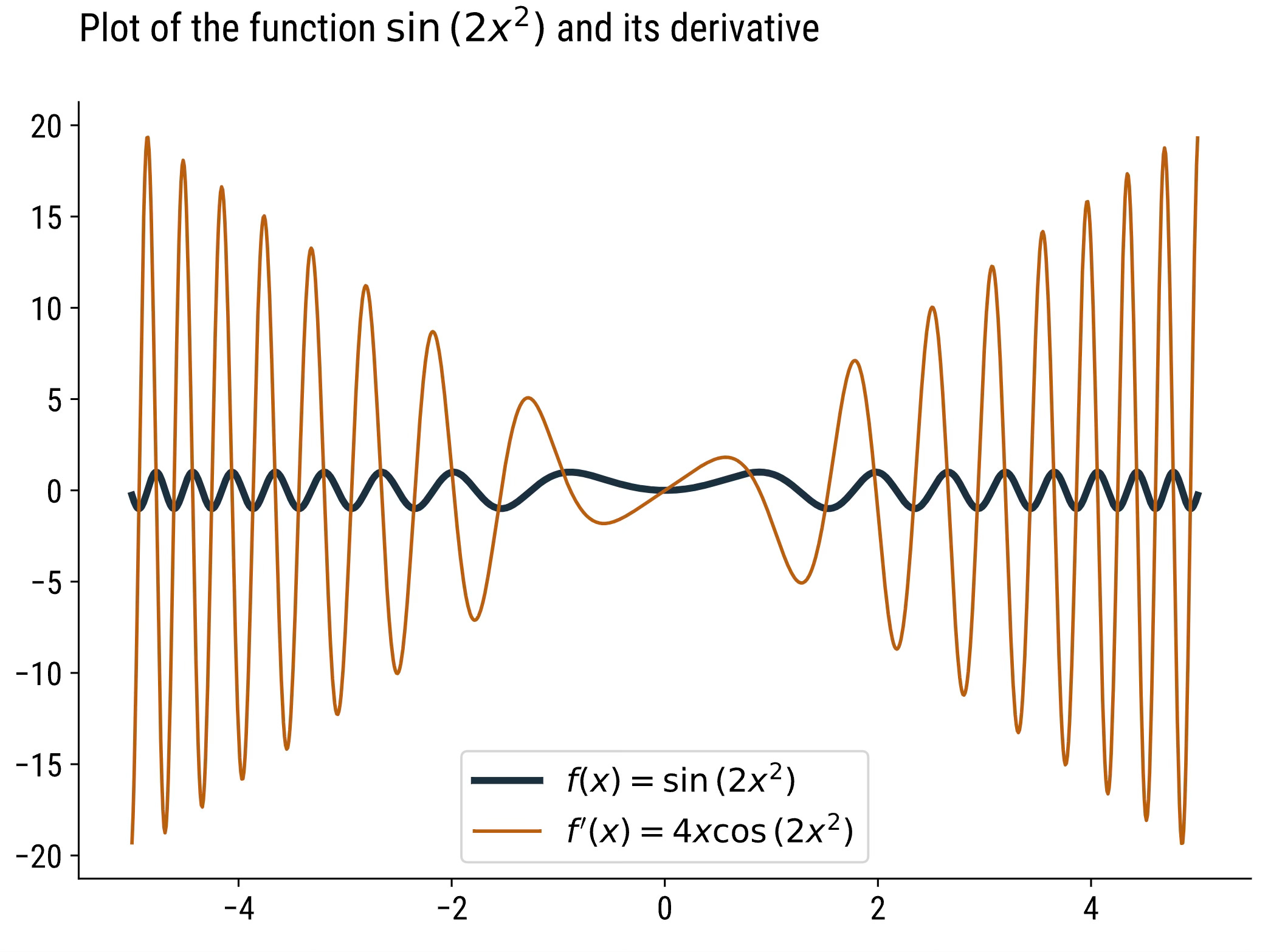
The chart now contains all the information the reader needs to get the full picture.
Summing up
Any time you want to include math equations in your Matplotlib charts, there are three things you must remember:
Use SymPy to validate your equations.
Use its sym.latex() function to turn the equation into a LaTeX expression.
Surround LaTeX expressions with dollar signs ($) in Python strings. Then, pass them to plot titles and/or series labels.
And that’s it - easy, but effective. Stay tuned for more math-specific content around data visualization.
Download today’s notebook: