
How to Visualize Strava Route Gradients and Gradient Ranges - Awesome Strava Charts #5
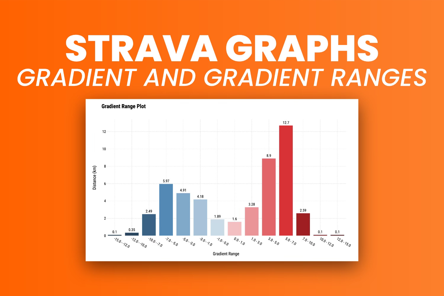
Steep and short climbs don't show well on Strava - Use gradient ranges to paint a full picture.

You might think your last ride was tough, but how can you prove it?
One way is by looking at total elevation gain. It’s a good measure - the more climbing you do, the more effort you have to put out. But what about those pesky short bursts at an uncomfortable gradient level? What about that 1-kilometer-long 16% average climb that doesn’t show well on Strava?
That’s where gradient ranges come in. In today’s article, you’ll learn what they are, how to calculate them in Python, and how to visualize them with Plotly.

If you’re a paid subscriber, you can download the notebook here.
Strava Gradient Visualization with Plotly
This section will show you two ways to plot gradients in Python.
The first, incorrect way, shows what happens when you don’t address for GPS errors. Your cycling computer can fail and misread your elevation data. When this happens, you might see gradient differences of several hundred percent between points that are just meters apart.
The second, correct way, accounts for possible errors made by cycling computers. It limits the gradient to a set maximum and smooths out any suspicious data points.
Before you start, make sure to import the following Python libraries:
import numpy as np
import pandas as pd
import plotly
import plotly.express as px
import plotly.graph_objects as go
import plotly.offline as pyo
Also, read the parsed CSV file:
df = pd.read_csv("../data/strava_parsed.csv")
df.head(10)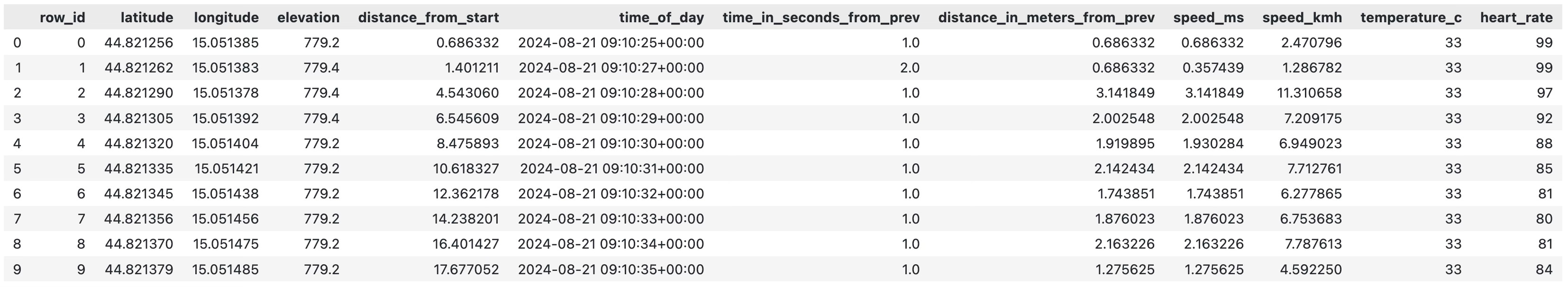
You will use the following function to plot the gradient with Plotly.
Keep reading with a 7-day free trial
Subscribe to Data Doodles with Python to keep reading this post and get 7 days of free access to the full post archives.