
How to Visualize Strava Activity Speed, Elevation, and Temperature - Awesome Strava Charts #3
Use Plotly to visualize basic statistics of Strava activities - Elevation profile, speed, and temperature

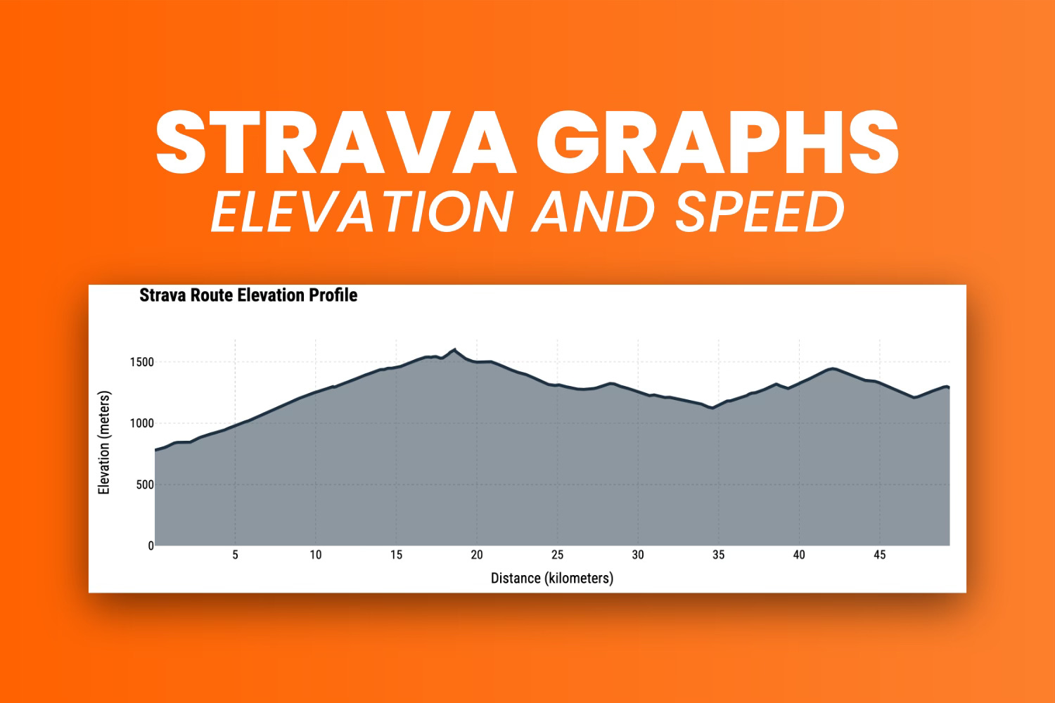
Nothing beats looking at the elevation profile a hilly route and and counting the number of peaks.
But I’ll give you one better - looking at the peaks and realizing you have a 20-kilometer (12.5 mile) descent ahead. It’s the perfect reward, especially after climbing for a couple of hours. We’ll talk about gradients another time.
In the last article, you saw how important interactivity is for visualizing map data. The same applies to any chart on a dashboard. Users want to feel connected and engaged, which is hard to achieve with static charts.

If you’re a paid subscriber, you can skip the reading and download the notebook.
Data Preprocessing for Visualization
My route dataset has over 11,000 data points.
You don’t want to plot all of them on one chart. It’s a recipe for stutters, slowdowns, or even crashes. Instead, you should sample the data to keep the important information while working with fewer points.
First, let’s take care of the library imports:
import pandas as pd
import plotly
import plotly.graph_objects as go
import plotly.offline as pyo
from datetime import datetime

pyo.init_notebook_mode()
The dataset is in a CSV file, so load it with this command:
df = pd.read_csv("../data/strava_parsed.csv")
df.head(10)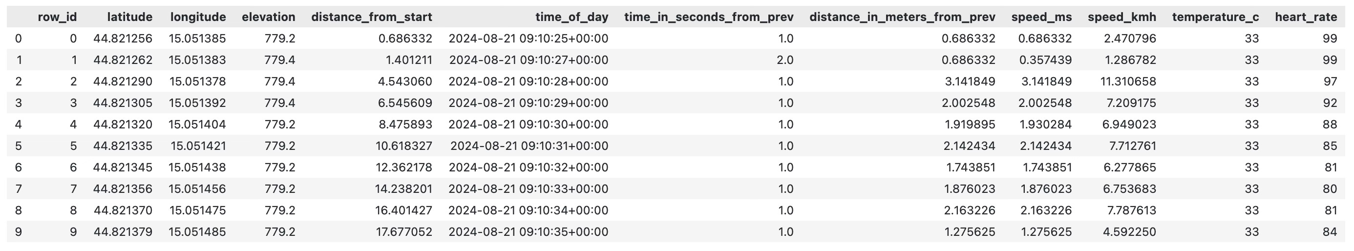
Now, you’ll need to resample the data and take the average for each sample.
The data points are recorded about 1 second apart, which is too much information. You can keep the key numerical attributes and resample at larger intervals—1 minute works well.
The following snippet does that, along with some date manipulation to make resampling work correctly:
# Keep only attributes of interest
df_plot = df[["distance_from_start", "elevation", "speed_kmh", "time_of_day", "temperature_c"]].copy()

# Convert distance_from_start to km
df_plot["distance_from_start"] = df_plot["distance_from_start"] / 1000

# Convert from string to datetime
df_plot["datetime"] = df_plot["time_of_day"].apply(lambda x: datetime.strptime(x.replace("+00:00", "").split(".")[0], "%Y-%m-%d %H:%M:%S"))

# Remove date string column
df_plot.drop("time_of_day", axis=1, inplace=True)

# Set date column as index and resample as 1 minute averages
df_plot = df_plot.set_index("datetime")
df_plot = df_plot.resample("1min").mean()

df_plot.sample(10)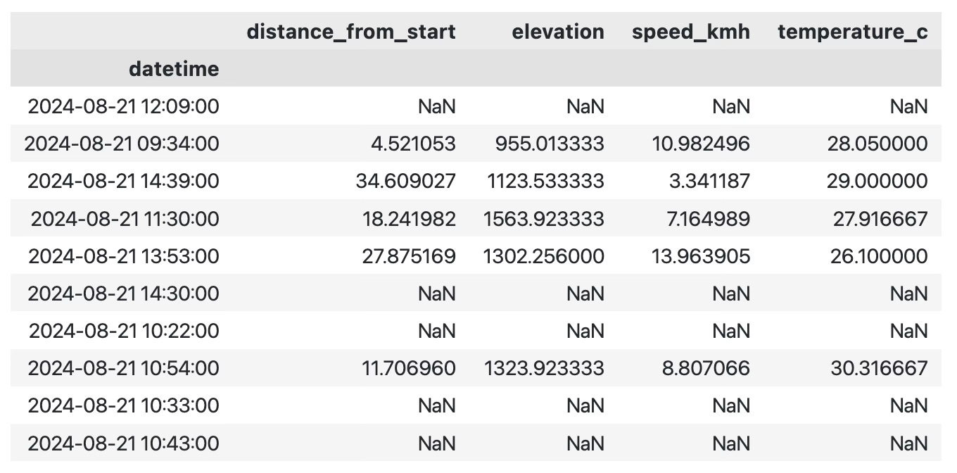
Some data points will be missing, and that’s normal:
df_plot.isnull().sum()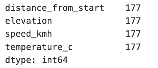
In total, we’re missing data for 177 minutes of the ride.
This happens because of stops. When you take a break from your ride for a few minutes, the GPS cycling computer pauses and doesn’t record new data. In code, if you resample the data to have a point for every minute, you’ll end up with gaps.
I don’t recommend dropping the missing points, but it’s your choice.
My preferred method is to fill in the missing values using linear interpolation.
For example, if the value at T-1 is 4 and the value at T+1 is 6, then the missing value at time T would be 5.
df_plot = df_plot.interpolate(method="linear", axis=0)
df_plot.isnull().sum()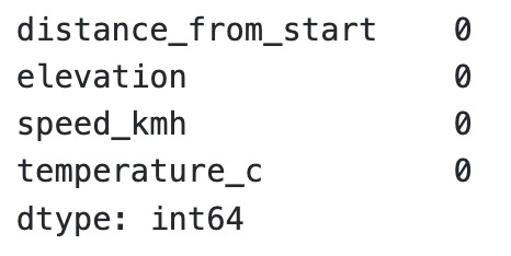
Now that your data is complete, let’s move on to visualization.
How to Visualize Strava Route Elevation Profile
Visualizing data with Plotly is easy, but making it look presentable is a whole different story.
Take this code for example. It creates a line chart showing the route elevation profile, with distance (in kilometers) on the X-axis and elevation (in meters) on the Y-axis:
Keep reading with a 7-day free trial
Subscribe to Data Doodles with Python to keep reading this post and get 7 days of free access to the full post archives.