
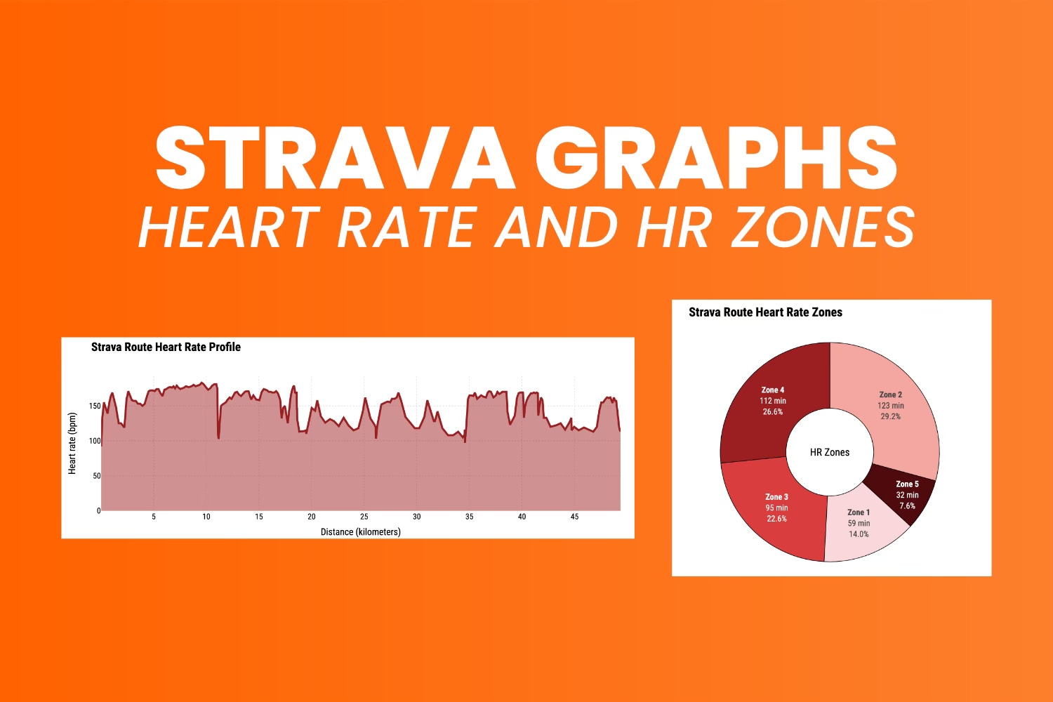
How to Visualize Heart Rate and Heart Rate Zones from a Strava Activity - Awesome Strava Charts #4
Use Python to calculate heart rate zones based on your age - and show results with Plotly!

Heart rate zones can give you useful insights about your workout.
Simply put, they show how hard you’re exercising on a scale from 1 to 5 (Zone 1 to Zone 5). Pushing harder isn’t always better, and most of the time, you’ll want to stay in Zone 2. This zone helps build endurance at a steady, comfortable pace that you can keep up all day.
You can figure out your heart rate zones based on your age. To be more precise, you can estimate your maximum heart rate and calculate the zones from there. In cycling, you can also use your FTP to calculate zones, but since I don’t have a power meter, I’ll focus on regular heart rate zones.
Today, you’ll learn how to calculate and visualize heart rate curves and zones.

If you’re a paid subscriber, you can skip the reading and download the notebook.
Data Preprocessing for Heart Rate Analysis
Just like in the previous article, the original route file has too many data points to plot at once (~11,000).
The goal is to keep the same information, but condense the packaging. You’ll see how to go about it in a minute, but first, let’s take care of the library imports:
import pandas as pd
import plotly
import plotly.graph_objects as go
import plotly.offline as pyo
from datetime import datetime

pyo.init_notebook_mode()
The dataset is in a CSV file, so load it with this command:
df = pd.read_csv("../data/strava_parsed.csv")
df.head(10)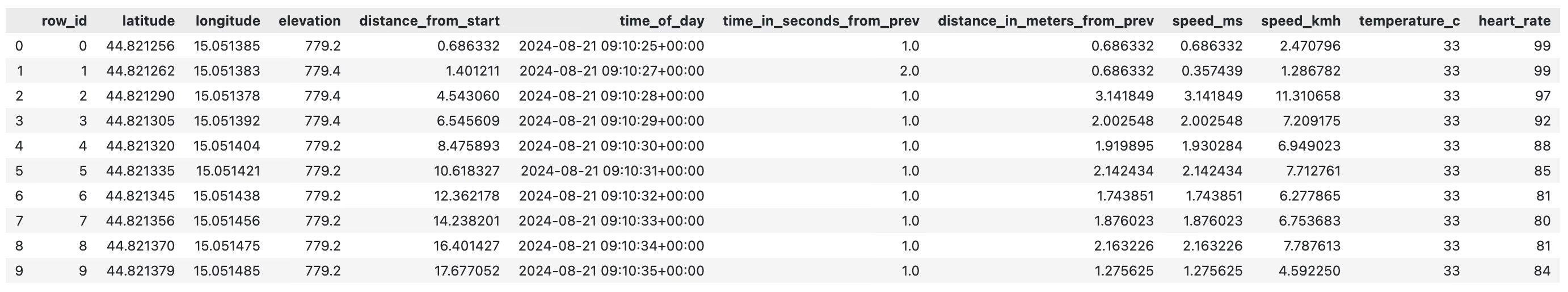
We’ll condense the dataset through resampling.
This means resampling the data so that each point represents one minute. Then, we’ll take the average of all data points belonging to the given minute. Since the original data has a point for every second, this will cut the number of points by 60.
The following code handles the resampling and also fills in any gaps caused by pauses (like coffee breaks) with linear interpolation:
# Keep only attributes of interest
df_plot = df[["distance_from_start", "time_of_day", "heart_rate"]].copy()

# Convert distance_from_start to km
df_plot["distance_from_start"] = df_plot["distance_from_start"] / 1000

# Convert from string to datetime
df_plot["datetime"] = df_plot["time_of_day"].apply(lambda x: datetime.strptime(x.replace("+00:00", "").split(".")[0], "%Y-%m-%d %H:%M:%S"))

# Remove date string column
df_plot.drop("time_of_day", axis=1, inplace=True)

# Set date column as index and resample as 1 minute averages
df_plot = df_plot.set_index("datetime")
df_plot = df_plot.resample("1min").mean()

# Linearly interpolate missing  values
df_plot = df_plot.interpolate(method="linear", axis=0)

# Convert heart rate to int
df_plot["heart_rate"] = df_plot["heart_rate"].astype("int")

df_plot.sample(10)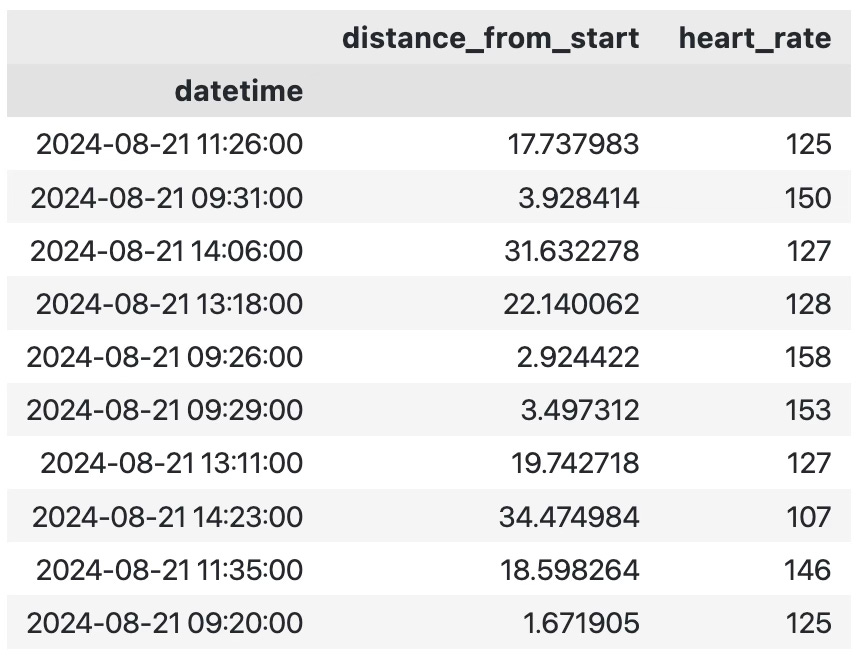
You now have a dataset showing your distance from the start line and average heart rate for each minute of the ride.
Let’s visualize it next.
How to Visualize Heart Rate with Plotly
If you’ve read the previous article on elevation, speed, and temperature visualization, this section won’t introduce anything new.
If you haven’t, go read that one first, as it explains the visualization code. Once you’re familiar with it, you can use the following snippet to create an area chart based on heart rate. The X-axis shows the distance from the start in kilometers, and the Y-axis shows the heart rate:
Keep reading with a 7-day free trial
Subscribe to Data Doodles with Python to keep reading this post and get 7 days of free access to the full post archives.