
How To Make Stunning Matrix Heatmaps with Matplotlib and Seaborn - Time Series Visualization #3
Time series and... heatmaps? An unconventional but powerful visualization type.


Have you ever used a heatmap to visualize time series data?
If not, you’re not alone. But it’s actually a very convenient way to spot patterns, whether monthly throughout the year or daily within a month.
In this article, I’ll share my favorite way to view time series data from a different perspective. By the end, you’ll know how to reshape your time series data into a matrix and display it as a heatmap.
Let’s dig in!
If you’re a paid subscriber, you can skip the reading and download the notebook instead.
Download and Organize the Dataset
These are the libraries you’ll need to follow along:
import pandas as pd
import matplotlib.pyplot as plt
import seaborn as sns
plt.style.use("custom-light")
I’m using my custom-light theme to change the look of the visualizations. If you’re interested, you can learn how to create a Matplotlib theme from scratch in this article:

Now, onto the dataset.
The Airline passengers CSV file is a great choice. It has 12 years of monthly data, which forms a perfect square matrix (not that it matters). You can load the dataset straight from GitHub - no need to download it first:
df_url = "https://raw.githubusercontent.com/jbrownlee/Datasets/refs/heads/master/airline-passengers.csv"
df = pd.read_csv(df_url)
df.head()
For the transformation, you’ll want to set years as the index and months as columns. The pivot() function in Pandas handles most of the work—just make a few small data type changes first:
df["Month"] = pd.to_datetime(df["Month"], format="%Y-%m")
df["Year"] = df["Month"].dt.year
df["Month"] = df["Month"].dt.month

mat = df.pivot(index="Year", columns="Month", values="Passengers")
mat.columns = ["Jan", "Feb", "Mar", "Apr", "May", "Jun", "Jul", "Aug", "Sep", "Oct", "Nov", "Dec"]
mat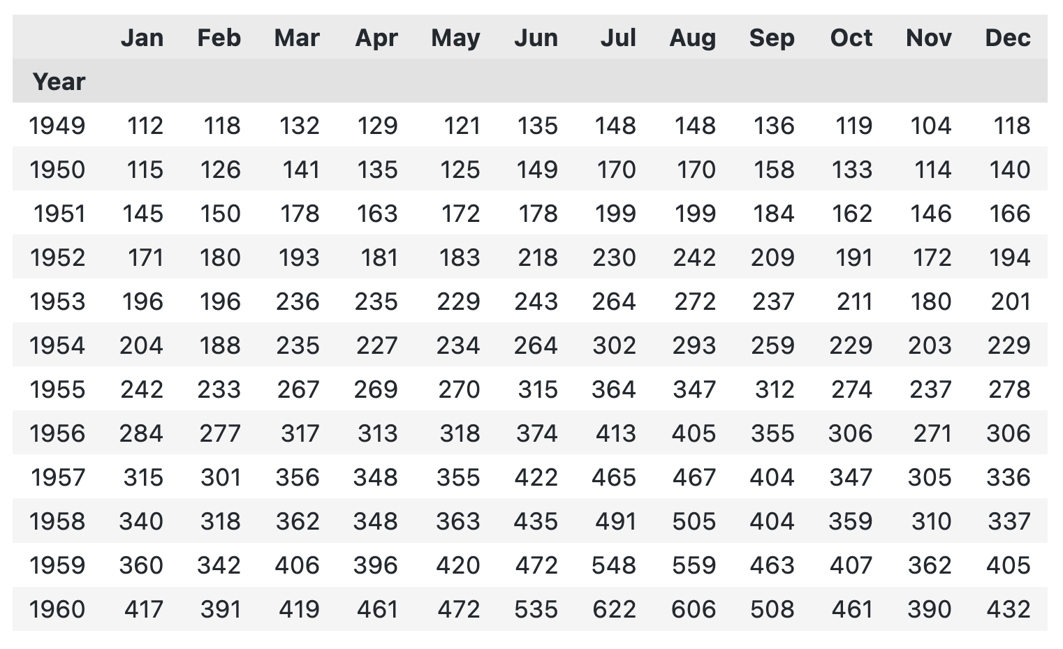
And there it is - a big, boring chunk of numbers. Next, let’s visualize it to make spotting patterns easier.
How to Visualize Matrix Data with Matplotlib
Truth be told, Matplotlib isn’t my first choice for visualizing matrices.
It has two functions - imshow() and matshow() - both of which are quite limited and will leave you wanting more. Still, I’ll show you how to use them here.
With imshow(), you can pass your Pandas DataFrame directly to make a heatmap:
plt.imshow(mat)
plt.show()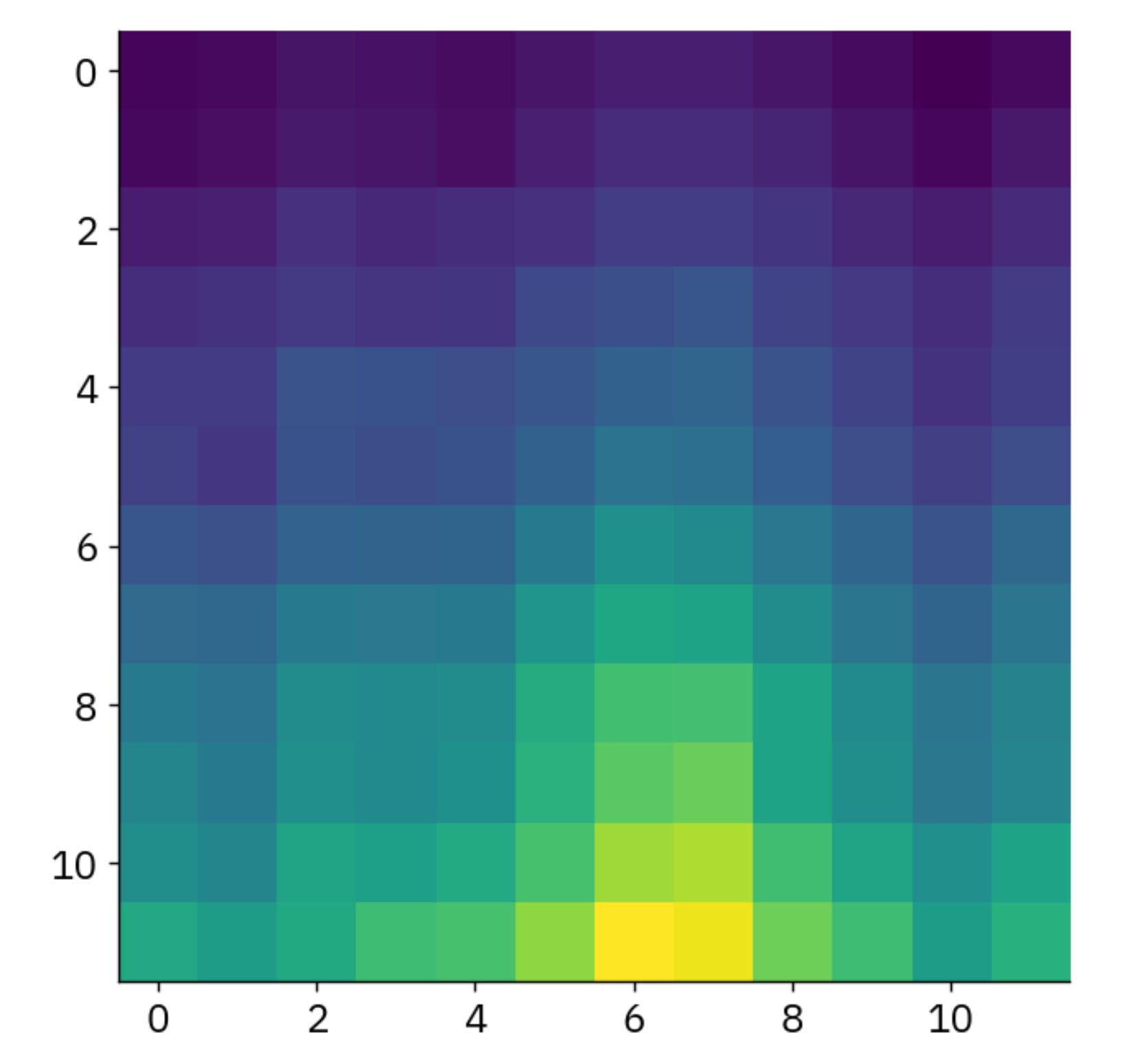
Trends are starting to emerge, that’s for sure, but you have no idea what the color scale means. To fix this, call the colorbar() function to add a legend for the continuous values.
I’ll show you how to do this with matshow(), and this time I’ll use a different color palette:
plt.matshow(mat, cmap="seismic")
plt.colorbar()
plt.show()
You can explore Matplotlib’s features further on your own, but it doesn’t offer much more. I suggest switching to Seaborn for better results.
How to Visualize Matrix Data with Seaborn
Seaborn is built on Matplotlib but lets you create better-looking charts with less code.
For visualizing matrix data, it offers the heatmap() function. You can customize it a lot, and I’ll show you how, but let’s start with the basics.
Run this code snippet to get started:
sns.heatmap(mat)
plt.show()
One feature I like about Seaborn is the ability to add a line between heatmap tiles. This makes it easier to distinguish between dark (low value) and light (high value) tiles:
sns.heatmap(data=mat, linecolor="white", linewidths=1)
plt.show()
Going further, you can add text to each tile and eliminate any guesswork from the equation. This lets the user see general trends and compare actual values for different years and months.
Keep the fmt parameter in mind - without it, the text values are printed using scientific notation:
sns.heatmap(data=mat, linecolor="white", linewidths=1, annot=True, fmt=".0f")
plt.show()
The great thing about Matplotlib and Seaborn is the sheer volume of available color palettes.
For heatmaps, these two categories work the best:
Diverging: Two color sets where one represents “bad” or low values, and the other shows “good” or high values.
Linear: A single color where darker shades mean higher values, though it can work the other way around too.
Let’s start with a diverging color palette - seismic works pretty well:
sns.heatmap(data=mat, cmap="seismic", linecolor="white", linewidths=1, annot=True, fmt=".0f")
plt.show()
But for this type of data, a single linear palette is always a safe choice.
Here’s a snippet that uses the Blues palette and adds a title—something you’ll need for a publication-ready chart:
sns.heatmap(data=mat, cmap="Blues", linecolor="white", linewidths=1, annot=True, fmt=".0f")
plt.title("Passenger Count Through Time (000)", y=1.04)
plt.ylabel("")
plt.show()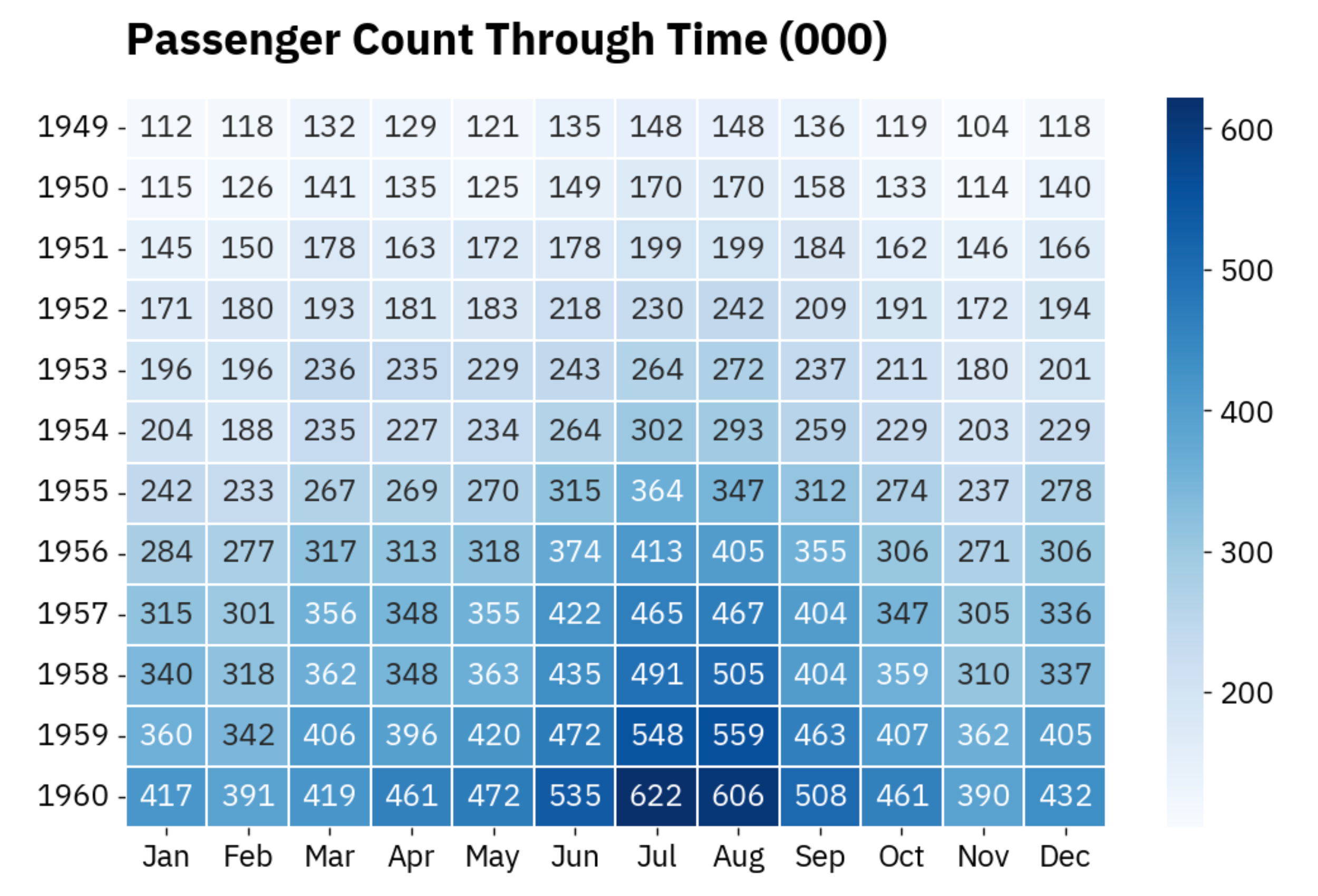
Simple, yet effective and packed with information.
Wrapping up
Heatmaps and matrix visualizations don’t typically come into mind when visualizing time series data.
Yet, it’s a valid alternative to line and area charts, especially when you want to spot trends. For instance, the heatmap you created today makes it much easier to identify top-performing months than trying to guess the month from the X-axis on a line chart.
You can also apply this to days of the month or hours of the day if your data is aggregated at that level.
Whatever the case, you now have the skills and tools to visualize your time series data in a new, unconventional way.
Until next time.
-Dario