
How to Create Interactive Strava Route Maps with Plotly - Awesome Strava Charts #2
Create maps from GPX data, change themes, add tooltips, and much more - all with Plotly.

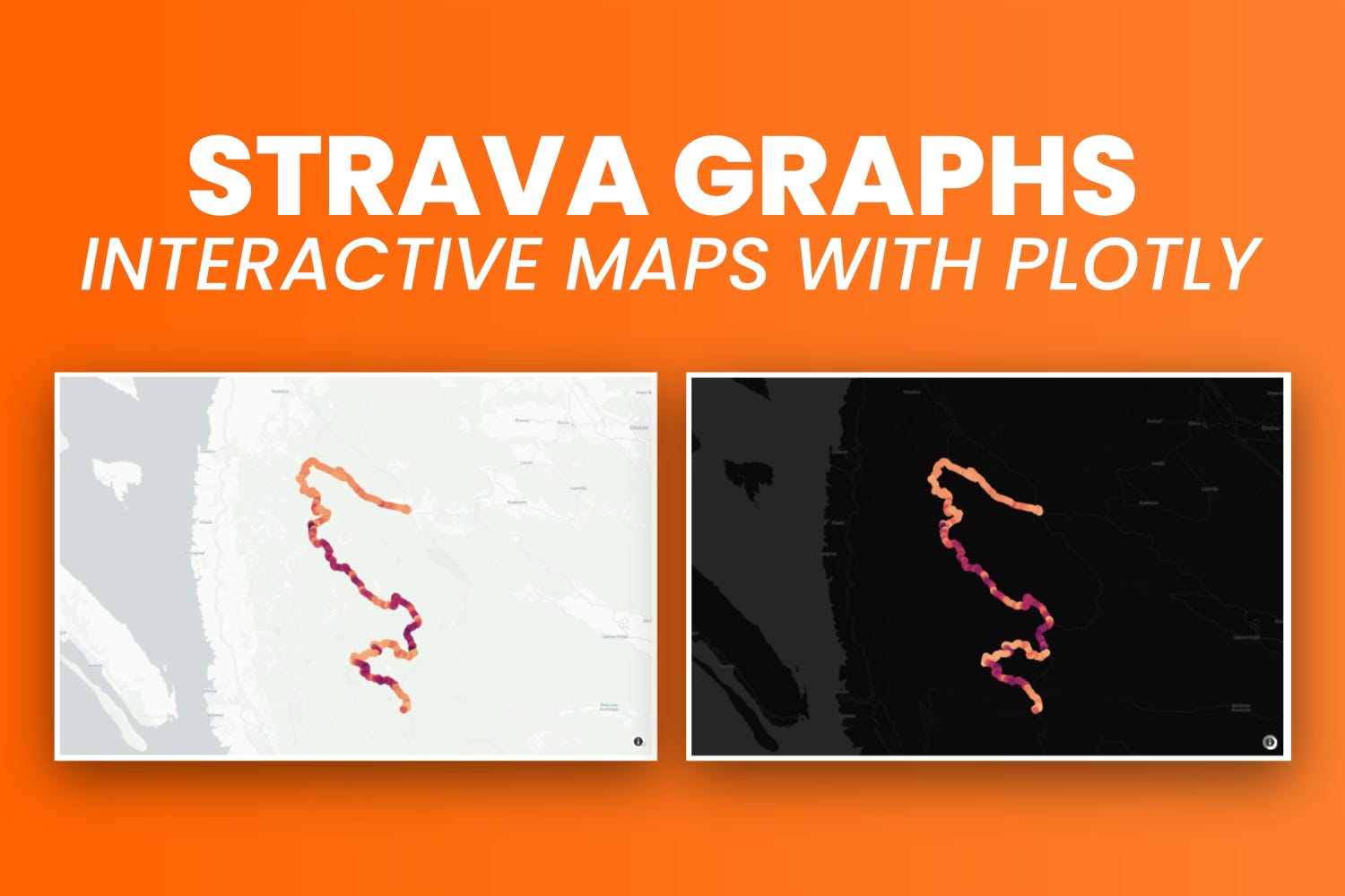
Static charts aren’t great for showing maps. What you really want is interactivity.
In the previous article, you saw that Matplotlib isn’t the best choice. You can plot coordinates as a scatter plot, but adding a map in the background isn’t straightforward. That’s why you’ll be using Plotly for the rest of this series. It’s easier to work with and has built-in support for interactivity.
By the end of this article, you’ll know how to display GPX data interactively. You’ll also learn to color the coordinates based on a continuous variable, similar to what Strava does in its premium version. Lastly, you’ll see how to add and style tooltips in Plotly and change the map’s theme.
If you’re a paid subscriber, feel free to download today’s notebook from GitHub.
Data Processing for Map Visualization
The original GPX file has over 11,000 data points.
Trying to show all of them at once will probably crash your computer. Think of it this way: it’s like a scatter plot with 11k points, but you also have a map in the background. Not a great idea.
So, first, you’ll need to import the right libraries and set up Plotly if you haven’t already. You can use the following code to do that:
import pandas as pd
import plotly
import plotly.graph_objects as go
import plotly.offline as pyo

pyo.init_notebook_mode()
The pyo.init_notebook_mode() is required if you’re running the code in a notebook environment.
Now, let’s cut down the data.
In plain English, you’ll want to keep every n-th point. This will space out the points on the map more evenly and ensure the map renders with the least amount of time possible.
I’ve also added a column that calculates the distance from the start of the trip in kilometers. You’ll use it later in the tooltip:
df = pd.read_csv("../data/strava_parsed.csv")
df_sampled = df.iloc[::10]
df_sampled["distance_from_start_km"] = df_sampled["distance_from_start"] / 1000

df_sampled.head(10)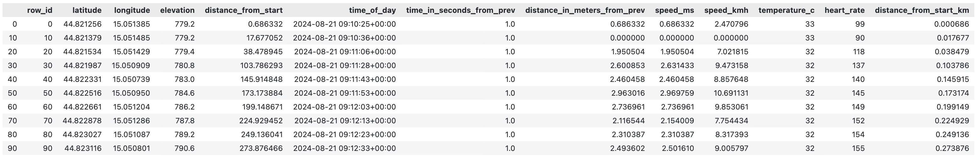
And that’s about all you need to create your first interactive map with Plotly.
Create a Basic Interactive Strava Route Map with Plotly
All Plotly charts need two things: data and layout.
For the data, you need to choose the type of chart and set the chart-specific options. For a geomap, the basics are latitude, longitude, and mode (which can be lines, markers, or both).
The layout is where you adjust the overall look of the chart. Some settings are specific to certain chart types (like mapbox), while others are more general (like width and height).
The go.Scattermapbox() function will plot a route on a map based on the given location. Here’s an example:
Keep reading with a 7-day free trial
Subscribe to Data Doodles with Python to keep reading this post and get 7 days of free access to the full post archives.